Kura Hulanda
A website that lets a museum of hard history speak in its own voice, to locals, tourists, researchers and other museums.
- Role
- UX designer
- Scope
- Research sessions, sitemap, content framework, design system
- Year
- 2025
- Team
- David van Delden, Rieven Martis and a junior designer I guided
A museum of some of the hardest history in the Caribbean had a website that no longer said what it stood for. We gave it one voice, for four very different visitors.
An out-of-date site, no clear identity online, and visitors missed on the walk from the cruise port.
Ran the research sessions, defined four audiences, the sitemap, the content framework and the design system.
A live storytelling site the museum runs itself, with one colour and one voice per exhibit.
A strong mission, a site that hid it
The museum had renewed its mission. Online, none of it showed. Scroll through what we heard in the sessions.

Four audiences, four doors
The sessions named four groups the site has to serve. Each one gets its own way in from the first screen.

Plan a visit
Prices, hours and the short walk from the port, on one screen.

Come back, take part
Resident prices, volunteering and friends of the museum.

Go deeper
The collection, the exhibits and the story behind them.

Work together
Exhibitions, programmes and research, as dialogue.
Calls that shaped the site
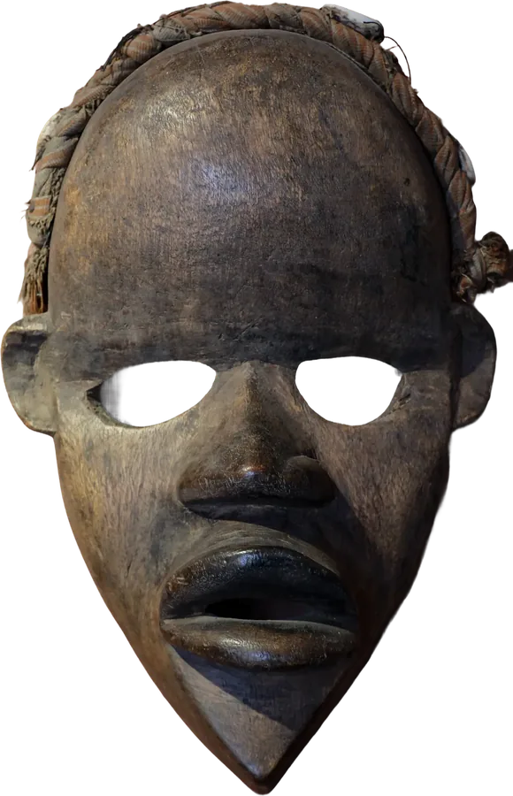
 West Africa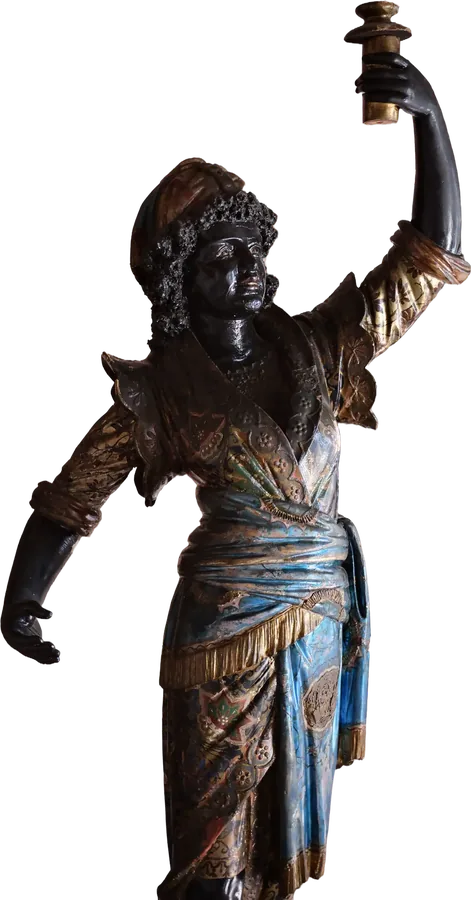
 Atlantic world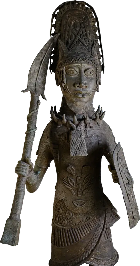
 Kingdoms
One colour per exhibit, the objects in front.
A dark ground and one deep colour per exhibit, so the real objects carry each page and visitors always know which story they are in. Move over the objects to see their ridges.
What it cost: every new exhibit needs its colour and imagery decided before it goes online.

The first screen is the place, not the price.
Pages open on the building, the people and the history. Tickets are never more than one click away, but they do not lead.
What it cost: one more scroll before the prices for a visitor in a hurry.

Real photographs first. AI only where history left no picture.
The museum photographed its own collection. Images were generated only for moments no camera recorded, and each one was checked.
What it cost: a historical check before any generated image went live.
From a slogan to a museum voice
Early directions led with a protest line in hand-cut type. Strong, but every page shouted. The final design keeps that type for the name and lets the objects speak.


Desktop and phone
Many visitors look the museum up on a phone, often on the walk from the cruise terminal.
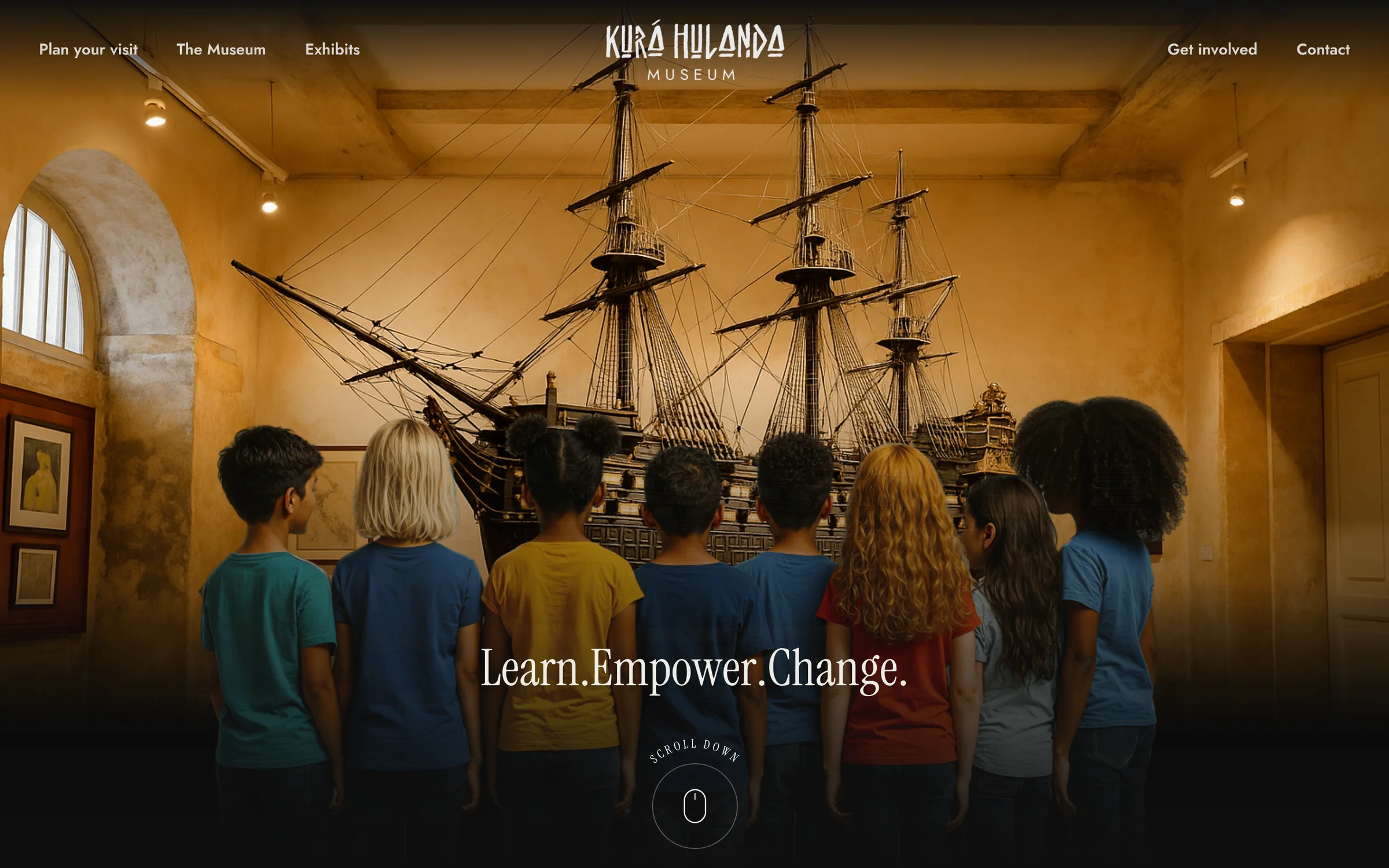
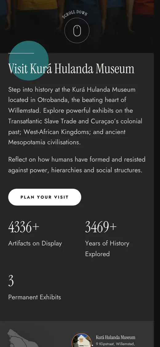


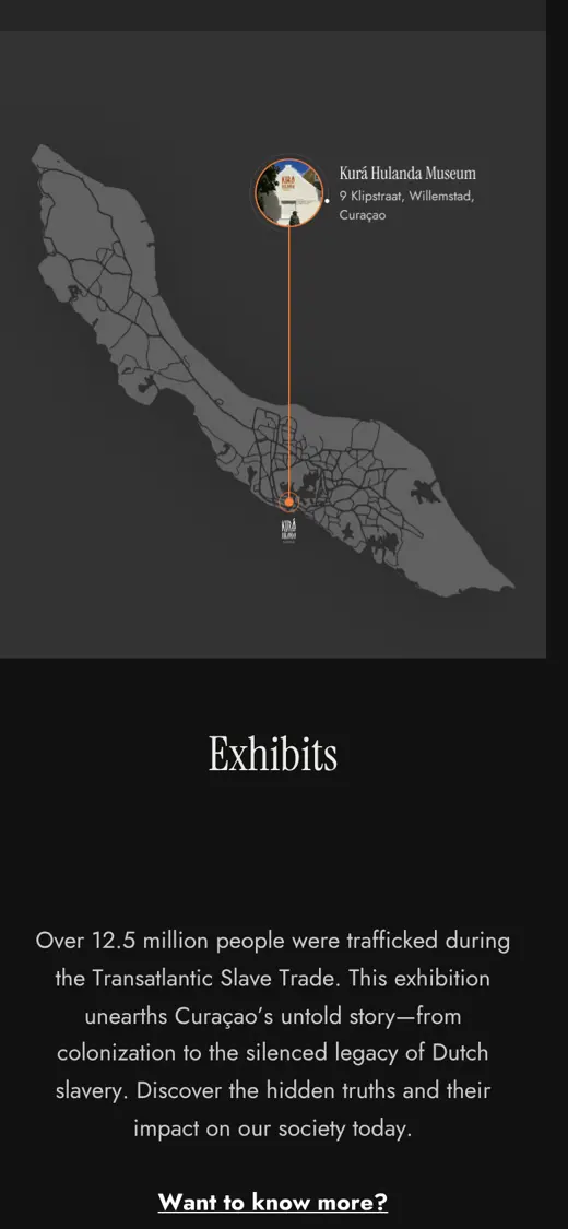
Desktop screens are vectors rendered from the final design file. Phone screens are from the live site.
Live, and run by the museum
New exhibits drop into the same structure and colour system without us.
David van Delden, creative director. Rieven Martis, developer. A junior designer, whom I guided. Ngrane.
How many visits reach a ticket price from the first screen, and time spent per exhibit.
 NextThe LabExperiments: AI video, a city rebuilt in 3D, a learning journey.